Profit per Hour (PPH) modeling
≈ 26 min read · 5,246 words
At the café the guest asks for a medium coffee, and every single time you hand them a large cup, at the same price. The guest is happy, yet at the daily close the money is missing: every cup carries a difference nobody paid for. The same thing happens in a process plant when the product is consistently made to a better quality than the customer asks for and pays for. You settle the extra in energy, in capacity and in equipment load. Profit per Hour (PPH) modeling makes exactly this visible: it does not ask how many tonnes you produced, but how much margin the plant earned per hour. Let’s look at what the method is, why hourly margin is the right yardstick, and where quality giveaway hides.
Profit per Hour (PPH) modeling rates a plant by the margin earned per hour (€/h), not physical yield, and exposes the cost of quality giveaway.
Its inputs are the shadow prices of the products, the energy price and the actual yield data. Its output is the PPH curve, which shows the operating mode that is best in value terms, and reveals the quality giveaway: the needless energy and capacity cost of a quality better than the specification.
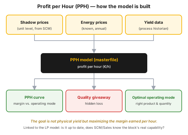
Figure 1 — how the PPH model is built. Its inputs are the per-product shadow prices, the known annual energy prices and the yield data taken from the process data historian; these form the masterfile-based PPH model, whose outputs are the PPH curve, the exposure of quality giveaway and the optimal operating mode.
Who is this for?
Section titled “Who is this for?”This article is for those who decide day by day about the yield, quality and energy use of a plant: process engineer · plant manager · shift supervisor · control-room operator · process technologist · energy manager · production planner and scheduler (SCM) · Lean/CI coordinator · production lead.
Learning objectives
Section titled “Learning objectives”After reading this article you will be able to:
- explain why the physical yield maximum is not the same as the value maximum;
- list the inputs of the PPH model, and say where each piece of data comes from;
- read a PPH curve, and point out the giveaway zone on it;
- recognize where quality giveaway arises, and with what tool it can be eliminated;
- place PPH in the planning–scheduling–execution chain, between the LP model and plant control.
In brief
Section titled “In brief”- It optimizes on value, not on volume. PPH maximizes the margin earned per hour (€/h), not the physical yield, because the products carry different shadow prices and energy carries a different cost.
- Three inputs: per-product shadow prices (shadow price, at unit level, from the planning/SCM side), known annual energy prices and actual yield data from the process data historian. The masterfile holds these together.
- PPH curve: it plots the hourly margin against the operating point, or the operating mode, and shows the optimum.
- Quality giveaway: when the product is made to a better quality than the customer requires. We spend needless energy and capacity on the extra quality, and PPH puts a number on it.
- The physical yield maximum is not the same as the value maximum. Where each of them lies is decided by the ratio of shadow prices to energy prices, not by an eternal rule.
- Giveaway is a deviation from the optimum. The right goal is not “the best possible quality” but the right target value plus an acceptance range, that is, the technological optimum in the service of the business optimum.
- It is connected to planning. The shadow prices come from the LP model, and the demand side is given by the weekly production program (WPP), so PPH is at the same time a test of the planning model’s validity.
Why it matters (the stakes)
Section titled “Why it matters (the stakes)”Giveaway is a dangerous waste type because it disguises itself as good work. The board is green, the lab objects to nothing, the customer is satisfied — meanwhile three invoices run in the background: the one for the surplus energy, the one for the tied-up capacity and the one for the needless load on the equipment. A column run at a higher temperature with a sharper cut burns more fuel, pushes the same quantity through more slowly, and cokes up faster in the process.
The size of the stake is backed by the public literature too: the Lean study by Wilson and Farley gives as an example a 2 million a year of extra revenue from better blending and measurement practice, with no capital investment. PPH is the measuring instrument for this loss: it does not buy new equipment, it shows you where you are giving away for free something nobody asked for.
What is Profit per Hour (PPH) modeling, and why do we optimize on hourly margin?
Section titled “What is Profit per Hour (PPH) modeling, and why do we optimize on hourly margin?”PPH modeling measures plant performance in margin earned per hour: from the value of the products made it deducts the cost of energy and the other variable inputs, then normalizes to one hour. This is the right yardstick because maximizing physical yield misleads for two reasons. First, the products are of different value, so less of a higher-margin product can be worth more than more of a low-margin one. Second, for higher yield or better quality ever more energy has to be burned, and that is a cost. PPH handles both effects at once, and therefore gives the real economic optimum.
The method is a tool of the Energy & Yield (E&Y) workstream, and it answers three simple questions for a plant block (for example a distillation complex): are we producing the right products, in the right amounts, and are we not over-delivering on quality?
How is the PPH model built?
Section titled “How is the PPH model built?”The data requirement of the PPH model is well defined, and it comes together from three inputs in a single working file (masterfile).
- Shadow prices for every product, at unit level, from the planning/SCM side. The shadow price is the internal price of the LP model: it shows how much the value of the complex would grow if one more unit of that product or constraint were available. This is what makes it possible to measure physical yield in money.
- Energy prices, typically the known, annual prices. The energy cost of a process plant can be modeled well, because the range of carriers and the consumption pattern are stable.
- Yield data from the process data historian (in practice typically a PI or PHD type system), by product and by unit, as a trend, together with the reasons for the changes.
In practice a more detailed data set is needed for the curve to be not only pretty but usable. The typical data list of the diagnostics:
| Data | Breakdown / frequency | What it is needed for |
|---|---|---|
| Shadow prices | annual average and monthly value, €/t or €/MWh by energy carrier | converting physical yield into money |
| Yield variability by unit | by product, 6–12 months | exposing the spread and its root causes |
| Value of the feed processed | by unit | the input side of the margin |
| Value of the fractions produced | by product | the output side of the margin |
| Cost of energy and other utilities | by energy type, daily or monthly | the input to be deducted from the margin |
| Plan and actual yield | daily | the basis of deviation analysis |
What does the PPH curve show?
Section titled “What does the PPH curve show?”The PPH curve plots the hourly margin against the operating mode, and shows where the plant setting is that is best in value terms. On the x axis is the “severity” of the operating mode, that is, the setting with which the operator sharpens the product: for a distillation column typically the cut point (for example T95), the temperature or the feed rate. On the y axis is the hourly margin.
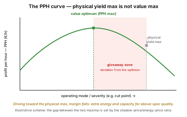
Figure 2 — an illustrative scheme of the PPH curve. The hourly margin rises with the severity of the operating mode up to an optimum, then falls, because beyond a point the marginal increase in value becomes smaller than the extra energy cost needed for it. The physical yield maximum and the value optimum do not coincide; the range in between is the giveaway zone.
This distinction is the essence of the method. Whoever “drives for physical yield” easily oversteps the value optimum: apparently they are producing well, in reality they are piling up a hidden loss. The comparison below puts the two viewpoints side by side.
| Aspect | Physical yield view | Value (PPH) view |
|---|---|---|
| What it maximizes | tonnes, purity, yield % | hourly margin (€/h) |
| How it treats energy | a technological given | a cost to be deducted from the margin |
| How it treats the products | equal in rank | of differing shadow price |
| The quality reserve | a “safety margin” | giveaway, that is, a deviation from the optimum |
| Typical decision | “let’s raise the severity further” | “how far is it worth raising?” |
| Its risk | surplus energy, surplus load | with a wrong or outdated shadow price, a false optimum |
What is quality giveaway, and how can it be eliminated?
Section titled “What is quality giveaway, and how can it be eliminated?”Quality giveaway is when the product is made to a better quality than the customer requires, and nobody pays for the extra quality. The most useful frame, however, is not “too good quality” but this: giveaway is a deviation from the optimum. The business optimum arises from the meeting of the right target values and the technological optimum, that is, optimum quality with optimum energy use. Every deviation from this is a cost, whether downward (off-spec product) or upward (giveaway).
Where does it arise? Typically at blending: we ensure the quality of the finished product by “overblending”, that is, we work with a margin so that the lab result surely falls inside the limit. In the waste typology this has a precise place: among the eight waste types, giveaway is the textbook case of over-processing, “producing a better quality than expected”, while reblending because of poor quality is rework. See muda.
What is the antidote? Not eliminating the margin, but the two-sided internal target range. The classic specification is one-sided (“at most X”), so it leaves the way open downward, toward infinite giveaway. But if for the key streams we prescribe an internal quality target value and an acceptance range (with a lower and an upper limit), then yield maximum, energy minimum and reduced giveaway become achievable at the same time, because the quality limits are deliberately exploited, not fled from.
A process-industry worked example (anonymized extract). At an aromatics distillation column, the external limit for a contaminant present in the product was 50 ppm. The internal prescription earlier contained no lower limit, so for years the plant worked with an average of around 7 ppm, that is, with less than a seventh of what was allowed, at the price of considerable surplus energy use.
| Indicator | Earlier practice | After introducing the internal target range |
|---|---|---|
| External (customer) limit | max. 50 ppm | max. 50 ppm (unchanged) |
| Internal prescription | upper limit only, open at the bottom | 25–50 ppm acceptance range |
| Actual average | ~7 ppm | pulled inside the range |
| The range after production stabilized | – | the lower limit raised to 30 ppm |
The lesson in one sentence: a narrowed, two-sided target range turns giveaway into energy savings, without violating the external specification. And the energy and capacity that is freed up should not be “accounted for” but allocated to the next bottleneck.
What keeps it alive? The daily plan–actual report loop. Alongside the automatic comparison of plan and actual, the plant must comment on the significant deviations, and the feedback runs in three directions: an unrealistic expectation has to be corrected in planning, underachievement in operation, and sustained overachievement has to be fed back into the planning model, because that is the new target level. For this, the lab result, the prescribed range and the online measurements have to be in one database, alongside an e-logbook, otherwise the commenting becomes a formality.
How does PPH connect to the LP model and the planning chain?
Section titled “How does PPH connect to the LP model and the planning chain?”PPH is not a standalone island: its shadow prices are given by corporate planning optimization, and its result is used by scheduling and by plant control. The optimization problem has three components: the objective function we want to maximize or minimize (here the margin), the variables that influence the value of the objective function, and the constraints that permit certain values and exclude others. The task reads: find those values of the variables that optimize the objective function while respecting the constraints. In the process industry this is typically solved with linear programming (LP), and the industry tool is PIMS (Process Industry Modelling System).
The canonical frame of value-based thinking is the netback calculation: every feedstock has a product yield whose value, calculated at the region’s product prices, is the gross product value (Gross Product Worth, GPW). Deducting the variable processing costs from this gives the plant-gate value, then deducting the freight cost as well gives the netback value, and finally subtracting the feedstock price gives the netback margin. PPH essentially takes this same logic down to the level of one unit, one hour.
In practice the chain consists of five steps: planning model → business and rolling plan → scheduling and weekly production program → production → distribution and sales. And the feedback comes back along the same path, through the daily plan–actual report.
The same thing broken down by time horizon gives a decision pyramid, and shows well where PPH stands:
| Level | Time scale | Scope | Typical tool |
|---|---|---|---|
| Planning, optimization | month | corporate | LP model, rolling plan |
| Scheduling | day | plant | weekly production program (WPP) |
| Unit optimization | hour | unit | PPH curve, operating-mode choice |
| Process control | minute | process | DCS, APC |
The PPH analysis is therefore at the same time a test of the planning model’s validity, with three recurring questions:
- Is the LP model up to date? Are the real yield curves and constraints reflected in it?
- Does commercial (SCM/Sales) understand the block’s real capabilities? If the plan asks for a product mix the block cannot produce well, value is lost.
- What do the “what-if” runs show? Comparing the value of alternative operating modes and product mixes.
On the supply chain side, the PPH logic fits into a wider goal list: to meet demand optimally, to synchronize feedstock arrival and product dispatch, to reduce quality giveaway, and to shorten the time in which on-specification product is made.
Process-industry context and safety
Section titled “Process-industry context and safety”The diagnostics of the yield branch follows a question tree whose root reads: how do we maximize the value of the plant block’s yield? This splits into two branches: are we ensuring the production of the right products, and are we achieving the target yield in them? The typical elements of the analysis:
- analysis of the block’s stability, of yield variability and of its root causes;
- mapping the manual (human) control variables in three groups: key variables, the variables handed over to APC, and the variables that stay in hand even alongside APC;
- taking the energy–yield interactions into account, because raising yield often demands energy, and the two have to be optimized together (see the Energy & Yield workstream);
- reviewing catalyst choice and use;
- aligning with the quality requirements of suppliers and customers, that is, how far the specification can realistically be taken;
- diagnostics of the KPI and management system: what we measure, what it incentivizes, and whether the feedback reaches down to the shift (see the KPI/PI/I hierarchy);
- treating hydrocarbon production and utility production separately, because the value logic of the two differs.
The concrete shadow prices, yield figures and equipment identifiers are confidential plant by plant; this article describes the methodology and publishes no internal business data.
Putting it into practice
Section titled “Putting it into practice”A first PPH analysis can be produced in a few weeks if you keep the steps in order. The roadmap below applies to a single unit or block.
- Choose the target unit, preferably one where there is real operating-mode freedom and significant energy use.
- Collect the current shadow prices for every product, at unit level, from planning, and record whether they are an annual average or a monthly value.
- Take the known, annual energy prices, by energy carrier.
- Collect the yield data from the process data historian, by product and by unit, as a trend, with the reasons for the changes.
- Build the masterfile: one file for the unit, containing the identifiers of the measurement points, the baseline and its justification.
- Calculate the profit contribution: product value minus energy and other variable cost, normalized to one hour.
- Draw the PPH curve for the relationship between margin and operating mode, with several real operating points.
- Identify the giveaway and the energy–yield interactions, then translate them into a proposed internal target range.
- Compare it with the demand of the weekly production program (WPP) and with past performance, then align with planning.
- Close the loop: daily plan–actual report, compulsory commenting of deviations, and feeding sustained overachievement back into the plan.
Hands-on part: a “giveaway hunt” in half a day. Call a process engineer, a shift supervisor, a planner and someone from the lab to one table. Bring with you the lab results of the last 6 months for two or three key streams, alongside the valid specification.
- Plot the distribution of the measurement results stream by stream, and mark the external limit.
- Ask: how big is the reserve up to the limit, and who decided it should be that big?
- Estimate what the reserve costs: which column, which furnace, how much extra firing or held-back throughput pays for it?
- Formulate a two-sided internal target range (with a lower and an upper limit) for one key stream, and record what happens if the measurement falls outside it.
- Close the workshop by agreeing that over the next month the deviations must be commented in the daily report, and that you will review this at the next session.
Homework for the participants: a week later everyone should bring one setting from their own area that turned out to have been set on a “better safe than sorry” basis.
Common mistakes
Section titled “Common mistakes”- Optimizing on physical yield instead of value. Why it’s a problem: the most volume is not the most margin. Instead: measure the margin, not the tonnes, and make the decision on the PPH curve.
- Not measuring quality giveaway. Why it’s a problem: without a PPH curve, above-spec quality looks like good work. Instead: turn the giveaway into a number, and assign the responsible setting to it.
- Working with a one-sided specification. Why it’s a problem: “at most X” leaves the way open at the bottom to infinite margin. Instead: a two-sided internal target range, with a lower and an upper limit.
- An outdated or misunderstood planning model. Why it’s a problem: with a wrong shadow price, PPH shows a false optimum. Instead: regular model maintenance, and clarify whether you are calculating with annual or monthly shadow prices.
- Ignoring the energy–yield interaction. Why it’s a problem: without the energy cost of the yield increase, the margin is overestimated. Instead: handle the two data sets in one model.
- Raising severity without a safety constraint. Why it’s a problem: driving into the giveaway zone also carries technical risk. Instead: always seek the economic optimum inside the operating and safety constraints.
- Treating PPH as a one-off analysis. Why it’s a problem: shadow prices and demand change. Instead: regular refresh and daily feedback into the shift.
When NOT to use it? (the limits of the method)
Section titled “When NOT to use it? (the limits of the method)”PPH is a strong tool, but it is not the right answer to every yield question. Knowing the limits is at least as important as the formula.
| Situation | Why PPH is not the right tool | The right answer |
|---|---|---|
| There is no reliable shadow price (the planning model is missing or outdated) | the input of the margin calculation is missing, the curve shows a false optimum | first maintain the planning model; until then, physical yield and energy KPIs |
| A single-product or fixed-recipe unit, without real operating-mode freedom | there is nothing to optimize, the curve is practically flat | energy efficiency (load curve analysis), availability (OEE) |
| The quality limit is a safety or regulatory obligation | the specification is not the subject of an economic bargain | the limit has to be held; giveaway can only be sought inside the limit |
| Transient state: start-up, shutdown, upset | hourly margin is not indicative at such times | stabilize first, per the start-up/shutdown procedure |
| The real loss is in availability (many outages) | PPH is the fine-tuning of a well-running plant | OEE, reliability, root cause analysis |
| There is no event-level data about what happened during the shift | the cause of the yield change cannot be traced back | first a shift log and structured data collection |
Rule of thumb: PPH is strongest when you have to decide, on a stably running, multi-product, energy-intensive unit, how far it is worth sharpening the operating mode.
Take it home (keys)
Section titled “Take it home (keys)”- Measure margin, not tonnes. The question is not how much you produced, but how much margin the unit earned per hour.
- Giveaway is a deviation from the optimum. Do not drive for “better quality”, drive for the right target value, with optimum energy use.
- Without a two-sided target range there is no giveaway management. A lower and an upper internal limit, inside the external specification; this is what turns the margin into savings.
- The shadow price is the heart of the model. With an outdated or misunderstood shadow price, PPH confidently points the wrong way.
- The safety and regulatory limit is not negotiable. The optimum is always to be sought inside it, never instead of it.
- Close the loop daily. Plan–actual report, compulsory commenting of deviations, and feeding sustained overachievement back into the plan. Without this, PPH stays a pretty diagram.
Self-test
Section titled “Self-test”Check how well the concept has settled. Open the answer key only afterwards.
- Raising a column’s severity, the white product yield keeps rising, but PPH is already falling. What is happening, and what do you do?
- The external limit of a product is “at most 50 ppm”, and the average of the last half year is 7 ppm. How much is the giveaway here, and with what tool would you reduce it?
- On which time horizon does the PPH curve live, and which level supplies its input shadow prices?
Answer key
- You have overstepped the value optimum and you are in the giveaway zone: the marginal increase in value is already smaller than the extra energy cost needed for it. The right move is to take the severity back toward the optimum of the PPH curve, within the operating and safety constraints.
- The giveaway is not the 7 ppm but the range left unused up to the limit, which you bought with surplus energy. The tool is the two-sided internal target range (for example 25–50 ppm), which can be narrowed further after production has stabilized, by moving the lower limit upward.
- The PPH curve lives at the level of unit optimization, on an hourly time scale. The shadow prices come from the planning, optimization level above it (the LP model), typically at monthly or annual resolution.
How does this show up in digital practice?
Section titled “How does this show up in digital practice?”The PPH logic does not stop at the monthly analysis: the same principle is realized in software too, and it becomes truly useful where the yield, quality and energy data arise automatically, in one place. The mechanism differs, the principle is the same.
| PPH element | Digital implementation | What it delivers |
|---|---|---|
| Yield data | automatic yield and energy data collection from the process historian, by unit | the model’s input does not come from manual gathering |
| Quality target range | the lab result, the online measurement and the prescribed lower–upper limit in one database, with a flag if it falls outside | the giveaway and the off-spec batch are visible immediately |
| Operating-mode setting | timestamped recording of the setting and the intervention | the yield change can be traced back to a concrete decision |
| Plan–actual feedback | automatic plan–actual comparison, compulsory commenting of deviations | the explanation arises at the shift, not a month later |
| Trend and report | KPI trend for quality and yield, sent out daily | the intervention is measurable in days, not in months |
Connection to OPEREX (shift log)
Section titled “Connection to OPEREX (shift log)”One weakness of PPH is that it easily stays a statistical analysis that does not reach down to the shift. The OPEREX shift log closes this: yield and quality settings, operating-mode changes and operator interventions (control room and outside) can be recorded with a timestamp, auditably. This way PPH performance becomes traceable to the concrete decisions of a given shift: quality giveaway will not be a line in a monthly report but an event tied to a specific setting, which can be discussed on a factual basis in the performance dialogue. The log data also put the historian-based yield trend into context: it becomes clear what happened during the shift that caused the yield change.
Terminology (HU / EN / JP)
Section titled “Terminology (HU / EN / JP)”| Hungarian | English | Japanese / note |
|---|---|---|
| óránkénti fedezet | Profit per Hour (PPH) | the main indicator (€/hour) |
| árnyékár | shadow price | the internal price of the LP model |
| minőség-túladás | quality giveaway | 無駄 (muda), a form of over-processing |
| túlmunkálás | over-processing | one of the 8 waste types |
| újrakeverés (utómunka) | reblending / rework | repair because of poor quality |
| kihozatal / hozam | yield | physical quantity |
| hozam-változékonyság | yield variability | the fluctuation of yield |
| energia-hozam kölcsönhatás | energy–yield interaction | to be optimized together |
| lineáris programozás | LP (linear programming) | the planning optimum model |
| folyamatipari modellező rendszer | PIMS (Process Industry Modelling System) | the industry tool of LP models |
| bruttó termékérték | Gross Product Worth (GPW) | the starting point of the netback calculation |
| netback árrés | netback margin | GPW minus costs and feedstock price |
| működési súlyosság | severity | the “sharpness” of the operating mode (e.g. cut point) |
| elfogadási tartomány | acceptance range | two-sided internal target range |
| fejlett folyamatszabályozás | APC (advanced process control) | the tool of intervention |
| heti termelési program | WPP (weekly production program) | the demand side, a plant instruction |
| terv-tény riport | plan-fact report | daily deviation analysis with commenting |
What is Profit per Hour (PPH)?
An hourly margin indicator and yield optimization method that measures, on the basis of shadow prices, energy prices and yield data, how valuably (not how much) a unit produces. Its goal is to maximize the margin earned per hour.
Why do we optimize on hourly margin and not on physical yield?
Because maximizing physical yield does not maximize value: the products carry different shadow prices, and energy use carries a different cost. PPH optimizes the margin earned per hour, so it gives the real economic optimum and makes quality giveaway visible.
What is quality giveaway?
When the product is made to a better quality than the customer requires, and nobody pays for the extra. In the most precise formulation, giveaway is a deviation from the optimum: we spend needless energy and capacity on quality beyond the specification. It typically arises at blending, in the form of quality ensured by a margin.
How can quality giveaway be reduced in practice?
With a two-sided internal quality target range. For the key streams we prescribe a lower and an upper internal limit inside the external limit, then narrow the range further after production has stabilized. This way the quality limits can be deliberately exploited, and yield maximum, energy minimum and smaller giveaway can be achieved at the same time.
How does PPH connect to the LP model?
The shadow prices come from the linear programming (LP) planning model, so PPH also tests the model’s validity: is it up to date, does commercial understand the block’s real capabilities, and what alternative operating modes do the “what-if” runs show? PPH lives at the unit optimization (hourly) level, the LP at the planning (monthly) level.
Is PPH not the same as Planned Production Hours?
No. In the glossary of production performance boards, the abbreviation PPH means Planned Production Hours, which is a concept of OEE and downtime accounting. In that meaning PPH is time, not money; Profit per Hour, by contrast, is hourly margin.
Related concepts
Section titled “Related concepts”the Energy & Yield workstream · energy cost waterfall · load curve analysis · APC and soft sensors · production planning and scheduling · the KPI/PI/I hierarchy · OEE · muda · shift handover · performance dialogue
Next step
Section titled “Next step”If you have understood this, from here it is worth going on — in this order:
- the Energy & Yield workstream — the frame in which PPH lives: how energy and yield are analyzed together on a plant block.
- production planning and scheduling — where the shadow prices come from, and how the weekly production program is born.
- APC and soft sensors — how the narrowed quality target range can be held in practice, without manual intervention.
References / further reading
Section titled “References / further reading”- Lonnie Wilson – Jason Farley: Lean Manufacturing in the Oil Refinery. BridgeGap Consulting Syndicate, 2010 — a public white paper on the process-industry application of Lean, with concrete giveaway and blending results.
- PIMS (Process Industry Modelling System) — the established, publicly documented tool family of process-industry LP modeling; the conceptual frame of model building, catalogue data and marginal values (shadow price) is known from here.
- George B. Dantzig: Linear Programming and Extensions. Princeton University Press, 1963 — the foundational work on the simplex method and linear programming, on which planning optimization is built.