The VSM toolbox: the 7 detailed mapping tools and Big Picture Mapping
≈ 18 min read · 3,558 words
A map is never 1:1 with reality — and that is exactly why it is useful. The metro has one line map for the passenger and a separate engineering track drawing for the maintenance crew: they show the same network at different resolutions, because the question is different. Value stream mapping works the same way: the Big Picture Map gives the overview of the whole journey on a single page, while the seven detailed tools each “zoom in” on one type of waste. They are not competing methods, but two magnifications of a single toolbox. Let’s look at what tools it consists of, what each one shows, and how the big picture is made.
The VSM toolbox works on two levels: the Big Picture Map maps the whole value stream, while seven detailed techniques map the specific wastes. The macro-level Big Picture Map shows the customer demand, the information and material flow and their relationship on a single page; each of the seven detailed tools is strong in a different type of waste. SIPOC’s high-level frame and Process Activity Mapping are the entry tools; the choice is aided by a “tool ↔ waste” matrix. The golden rule of mapping: always draw reality, not what is supposed to happen in theory. This toolbox is the detailed reference for the vsm method.
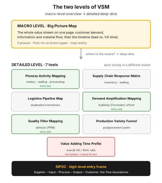 Figure 1 — the two levels of VSM: the macro-level Big Picture Map (the whole value stream on one page) and below it the seven detailed tools, each with its own type of waste; SIPOC is the high-level entry frame.
Who is this for?
Section titled “Who is this for?”This article is for those who map value streams or hunt for waste: process engineer · Lean/CI specialist · shift and plant manager · production planner · logistics specialist · quality engineer · supply-chain analyst · process technologist.
Learning objectives
Section titled “Learning objectives”After reading this article you will be able to:
- distinguish macro-level (Big Picture Map) from detailed mapping, and say when to start with which;
- list the seven detailed VSM tools, and say which waste each is strongest in;
- work through the five phases of the Big Picture Map on a value stream of your own;
- place SIPOC as a high-level entry frame;
- choose, based on a “tool ↔ waste” matrix, which tool to start with and which to leave for last.
In brief
Section titled “In brief”- Two levels: macro = Big Picture Map (the whole flow on one page); detailed = 7 tools (a deep-drill into one waste at a time).
- Each of the 7 tools is strong in a different type of waste — a matrix aids the choice.
- Entry tools: Process Activity Mapping (the low-hanging fruit), Demand Amplification Mapping (the cause of inventory) and Quality Filter Mapping (the defects).
- SIPOC: a high-level frame (Supplier–Input–Process–Output–Customer) to clarify the boundaries of the flow, before the detailed map.
- Who draws it: the Big Picture Map by the managers, the detailed maps by those who do the work — because only they know what really happens.
- Golden rule: map reality, not the quality manual.
Why map on two levels?
Section titled “Why map on two levels?”Because the macro-level picture shows where the waste is, and the detailed tools show why it is there and what to do about it. If you jumped straight into the details, you would easily drill deep in the wrong place; if you stopped at the big picture, you would see the trouble but be unable to cure it. The two together close the loop.
The stakes are tangible. In a typical value stream the product is being made for only a fraction of its time — the rest is pure waiting and storage. In the method’s classic illustrative example the total lead time is 22.75 hours, of which value-adding time is only 2.25 hours — that is, real value creation happens in less than 10% of the process. The remaining 90%+ is pure waste: inventory, waiting, unnecessary movement. The macro-level map makes this ratio visible at a glance; the detailed tools then tell you in which stage it arises and with which technique it can be attacked.
What are the 7 detailed VSM tools?
Section titled “What are the 7 detailed VSM tools?”The seven tools are mapping techniques each sharpened for one type of waste — they fill the “gaps” the Big Picture Map leaves. Each answers a different question, which is why they are not rivals but elements of a single set:
| Tool | What it shows | Which waste it is strong in |
|---|---|---|
| Process Activity Mapping | the process step by step (operation / transport / inspection / delay-storage) | motion, waiting, processing |
| Supply Chain Response Matrix | cumulative inventory vs. cumulative lead time | inventory, waiting |
| Logistics Pipeline Map | where process time and inventory pile up | duplicated inventories (at company/function boundaries) |
| Production Variety Funnel | the number of product variants per stage | where the product becomes customer-specific (postponement) |
| Quality Filter Mapping | the location of product, scrap and service defects (PPM) | defects |
| Demand Amplification Mapping | batch size and demand over time | the bullwhip (Forrester) effect |
| Value Adding Time Profile | the accumulation of VA and NVA cost over time | the overall value/waste ratio |
Briefly, what each one gives:
- Process Activity Mapping — the key and entry tool of detailed mapping: it records every single step (with the engineering O/T/I/D notation: operation / transport / inspection / delay-storage), with distance, time and the number of participants, so it immediately makes lead-time and productivity opportunities visible — not only on the production line, but in the information flow too.
- Supply Chain Response Matrix — on the vertical axis the cumulative inventory accumulated per stage, on the horizontal the cumulative lead time; the large blocks (long horizontal = delay, long vertical = high inventory) are the targets for savings.
- Logistics Pipeline Map — a complement to the Supply Chain Response Matrix: it shows where process time and inventory pile up within one organization; particularly good for revealing the duplicated inventories arising on both sides of company or functional boundaries.
- Production Variety Funnel — it draws the number of product variants per stage, and shows the point where the generic product becomes customer-specific; this point decides where it is worth holding a buffer (postponement) to avoid excess inventory.
- Quality Filter Mapping — it maps defects broken into three types (see below), on a PPM scale, along the stages of the value stream; it measures internal and external quality and customer service at once.
- Demand Amplification Mapping — it plots quantity as a function of time, and makes the bullwhip effect visible: demand fluctuation is amplified the further we move from the original source of demand. A month’s snapshot is often enough, four to six months gives a clearer picture.
- Value Adding Time Profile — it draws the accumulation of value-adding and non-value-adding cost over time; the area between the two lines is the cost of waste itself. The hardest to produce — worth leaving for last.
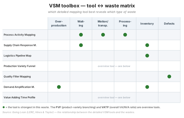 Figure 2 — tool ↔ waste matrix: which detailed VSM tool best reveals which waste. The Production Variety Funnel and the Value Adding Time Profile are overview tools, not sharp on a single specific type of waste.
How is the Big Picture Map made?
Section titled “How is the Big Picture Map made?”The Big Picture Map is a macro-level map taken from Toyota that, in five phases, draws the customer demand, the information and material flow and their relationship on a single page. The goal is that you can see the flows at a glance, where the waste is, and that the management team gets a shared picture before anyone dives into the details.
The five phases:
- Customer requirements — product family, demand, delivery frequency, packaging, customer inventory (the top-right corner of the page).
- Information flow — forecast, call-off, order quantities, right to left at the top of the page.
- Physical (material) flow — key steps, cycle times, inventory points, quality checks, rework loops, uptime, left to right at the bottom of the page.
- Linking — connect the information and material flows with arrows (what is the source and target of the scheduling, what happens on a disturbance).
- Timeline — at the bottom of the page, the total lead time and the value-adding time.
Who draws it? The Big Picture Map is drawn by the management / line-leader team (this delivers top-level commitment), while the detailed maps are drawn by those who actually do the work — simply because only they know what really happens, and because a plan that comes from below breeds commitment from below.
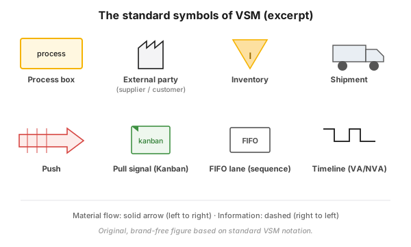 Figure 3 — the standard VSM notation used for mapping (process box, inventory, transport, kanban, FIFO, timeline); the generic icons of the Big Picture Map follow this symbol set.
What is SIPOC, and where does it fit?
Section titled “What is SIPOC, and where does it fit?”SIPOC is a high-level frame that, before detailed mapping, clarifies the boundaries of the value stream: from where to where it runs, what its inputs and outputs are, who its suppliers and customers are. The name is the initial letters of its five elements: Supplier – Input – Process – Output – Customer.
SIPOC and the MIFA are the two levels of process mapping (high → detailed): SIPOC frames the beginning and end of the process in a single row (where the study starts and where it ends), while the detailed map works out the steps within this frame. It is worth starting with SIPOC, because it prevents the most common mistake: that the team fails to agree on the boundaries of the process before getting into the details.
Which tool to use when?
Section titled “Which tool to use when?”At the start, Process Activity Mapping, Demand Amplification Mapping and Quality Filter Mapping are the strongest; leave the Value Adding Time Profile for last. The choice is driven by the type of waste — the tool ↔ waste matrix (Figure 2) tells you which technique is sharpest for which waste.
Practical order of introduction:
- Process Activity Mapping — the low-hanging fruit; it can be drawn first for almost any process, and immediately shows the motion/waiting/processing wastes.
- Demand Amplification Mapping — if the problem is inventory and fluctuating batch size: it shows why the inventory exists, and highlights the trouble with batch-size policies.
- Quality Filter Mapping — if defects and customer service are the sore point.
- Later: Supply Chain Response Matrix, Logistics Pipeline Map, Production Variety Funnel — for the more specific supply-chain and variety questions.
- Finally the Value Adding Time Profile — the hardest to produce; take it out only when the cost-based justification is truly needed (e.g. for management sign-off of a project).
How can it be used in the process industry?
Section titled “How can it be used in the process industry?”The process-industry value stream runs from raw material through the semi-finished and finished products to the customer — intermediate storage and variability stall the flow just as they do in discrete manufacturing. Here too the map makes visible that, for most of the lead time, the product is not being transformed but is standing in a tank or a buffer.
- Demand Amplification Mapping makes the bullwhip effect visible in the delivery and logistics chain — batched production and order fluctuation are amplified along the supply chain.
- Quality Filter Mapping shows the location of off-spec batches: where out-of-specification product passes into the next operation, into blending or into storage, and where the process-built quality control needs improving (see jidoka).
- Intermediate storage and variability (see muri) are typically the largest NVA source in the process industry — the Supply Chain Response Matrix and the Logistics Pipeline Map are precisely what quantify this accumulated inventory and time.
Common mistakes
Section titled “Common mistakes”The pitfalls of the VSM toolbox almost all stem from the wrong level or the wrong tool. In anti-pattern ↔ correction pairs:
- You map the manual, not reality. You draw the “how it should be” process. Instead: always record what actually happens — for this, bring in those who do the work, not just the managers.
- You drill straight into the details. Without a Big Picture Map you waste the detailed mapping on the wrong stage. Instead: first the big picture, then, targeted, the stage showing the largest waste.
- You deploy every tool at once. You produce all seven maps before fixing anything. Instead: start with the 1-2 tools that fit the type of waste (per the matrix), targeting the largest saving.
- You take out the Value Adding Time Profile first. This is the hardest, most data-hungry tool. Instead: leave it for last — only if the cost-based justification is truly needed.
- You skip SIPOC. The team does not even agree on the boundaries of the process, yet starts on the details. Instead: first SIPOC (from where to where), then the detailed map.
- The map is the goal, not a tool. A beautiful wall poster is made, but no action. Instead: let every map end in an action plan — mapping is the beginning of improvement, not the end.
When NOT to use it
Section titled “When NOT to use it”The VSM toolbox is strong, but not the right answer to every situation:
| Situation | Why (primarily) not the VSM toolbox | The right answer | ||
|---|---|---|---|---|
| Improving a single, isolated step | mapping is about the whole flow; too cumbersome for a narrow problem | targeted [[kaizen.en | kaizen]] or [[5-miert.en | 5 Whys]] at that point |
| The question is the root cause, not the flow | the map shows the where, not the why | cause investigation ([[5-miert.en | 5 Whys]], [[jidoka.en | jidoka]]), then a map for the effect |
| A small, one-person or very short flow | there are not enough stages and inventory points worth mapping | a simple flowchart or standard work | ||
| The process is not stable / not repeatable | freezing a changing process into a single map is pointless | first stabilize ([[5s.en | 5s]], [[standard-munka.en | standard work]]), then map |
Rule of thumb: the VSM toolbox is strongest when you are looking for the location and cause of waste in a repeatable, multi-stage value stream. For the root cause of a single point, or for an unstable process, a different tool is the right entry.
Key takeaways
Section titled “Key takeaways”- Two levels, one toolbox: the Big Picture Map gives the where, the seven detailed tools the why — always start with the big picture.
- The waste decides the tool: choose according to the matrix; Process Activity Mapping is the best entry, leave the Value Adding Time Profile for last.
- Map reality, not the manual — and bring in those who actually do the work.
- SIPOC first: clarify the boundaries of the flow before diving into the details.
- Let the map end in action — a poster on its own improves nothing.
Self-check
Section titled “Self-check”- How do the goals of the Big Picture Map and detailed mapping differ, and which should you start with — why?
- Give one type of waste each for which Process Activity Mapping, Demand Amplification Mapping and Quality Filter Mapping is the strongest tool.
- List the five phases of the Big Picture Map, and say which part of the page the customer demand, the information flow and the material flow go on.
How does this show up in digital practice?
Section titled “How does this show up in digital practice?”Value stream mapping does not stop at the brown wrapping paper: the same logic is realized digitally too. Instead of the static, one-off workshop drawing, in modern systems the map is filled with live data, and the waste becomes automatically measurable — the mechanism differs, the principle is the same.
| VSM principle | Digital implementation | What it delivers |
|---|---|---|
| Current-state map (reality) | automatic collection of real-time process and inventory data (lead time, downtime) | the map is not a snapshot but a live state |
| Timeline (VA vs. NVA) | automatically calculated lead time and value-adding ratio | the waste is measured, not estimated |
| Inventory points | continuous tracking of inventory and buffer levels | the duplicated/accumulated inventory shows immediately |
| Quality Filter (defect types) | digital logging of product, scrap and service defects, PPM trend | quality waste is trackable per stage |
| Future-state action plan | tracking of the improvement actions, owner and deadline | the map ends in action, not in a poster |
| Bullwhip / demand | time-series analysis of order and batch-size data | the amplification can be detected automatically |
Connection to OPEREX (shift log)
Section titled “Connection to OPEREX (shift log)”The one-off weakness of the VSM toolbox is that the current-state map remains a snapshot of one workshop, and quickly goes stale. In the OPEREX shift log the real data of the mapped value stream — the lead time, the per-machine downtime, the intermediate inventory points, the defect types — can be recorded shift by shift, retrievably, and the fulfilment of the future-state plan’s actions can be tracked too. This way the current-state map is filled with live, auditable performance data, instead of remaining a yearly workshop snapshot, and the deviations surface where they arise.
Terminology (HU / EN / JP)
Section titled “Terminology (HU / EN / JP)”| Hungarian | English | 日本語 / note |
|---|---|---|
| Értékfolyam-térképezés | Value Stream Mapping (VSM) / Material and Information Flow Analysis (MIFA) | 情報と物の流れ図 — Toyota’s material- and information-flow diagram |
| Makroszintű (nagykép) térkép | Big Picture Map | the single-page current-/future-state map taken from Toyota |
| Folyamattevékenység-térkép | Process Activity Mapping (PAM) | the entry detailed tool; O/T/I/D notation |
| Ellátásilánc-válaszmátrix | Supply Chain Response Matrix | cumulative inventory vs. cumulative lead time |
| Logisztikai csővezeték-térkép | Logistics Pipeline Map | duplicated inventories at organizational boundaries |
| Termékváltozat-tölcsér | Production Variety Funnel | the point of becoming customer-specific (postponement) |
| Minőségszűrő-térkép | Quality Filter Mapping | product, scrap and service defect in PPM |
| Keresletfelnagyítás-térkép | Demand Amplification Mapping | the bullwhip (Forrester) effect |
| Értékteremtőidő-profil | Value Adding Time Profile | VA vs. NVA cost as a function of time |
| Szállító–bemenet–folyamat–kimenet–vevő | SIPOC (Supplier–Input–Process–Output–Customer) | high-level entry frame |
The names of the seven detailed tools are validated from the published canon (Hines & Rich, 1997) and the source material (Going Lean); a Japanese equivalent belongs only to the Toyota-originated VSM/MIFA, the other tools are Western (UK-academic) developments.
What tools make up the detailed VSM toolbox?
Seven tools: Process Activity Mapping, Supply Chain Response Matrix, Logistics Pipeline Map, Production Variety Funnel, Quality Filter Mapping, Demand Amplification Mapping and Value Adding Time Profile. Each is strongest in a different type of waste — the choice is aided by a tool ↔ waste matrix.
What is the Big Picture Map, and how is it made?
A macro-level map taken from Toyota that shows, on a single page, the customer demand, the information and material flow and their relationship. It is built in five phases: customer requirements → information flow → physical flow → linking the two → timeline. With Post-it notes, on brown wrapping paper, always drawing reality.
Which is the strongest VSM tool in the supply chain?
Process Activity Mapping and Demand Amplification Mapping — the latter shows why the inventory exists, and highlights the problems of batch-size policies (the bullwhip effect).
Which tool is worth leaving for last?
The Value Adding Time Profile — this is the hardest and most data-hungry to map, and it is only worth producing when the cost-based justification is truly needed.
What should be mapped: the actual or the intended process?
Always reality, what actually happens — not what should happen in theory according to the procedure manual. That is why those who actually do the work must be involved in the detailed mapping.
What is the role of SIPOC alongside VSM?
SIPOC (Supplier–Input–Process–Output–Customer) is the high-level frame before detailed mapping: it clarifies the boundaries, inputs and outputs, suppliers and customers of the value stream. SIPOC and MIFA are the two levels of process mapping (high → detailed).
Related concepts
Section titled “Related concepts”vsm · the three types of activity · muri · muda · flow · kaizen · jidoka
Next step
Section titled “Next step”Once you have an overview of the toolbox, from here it is worth going on — in this order:
- vsm — the method itself: how to draw the current, ideal and future-state map step by step. This is the “host article” of the toolbox.
- muda — the seven (eight) types of waste on which the toolbox’s matrix is built: without it you do not know what you are looking for on the map.
- kaizen — the improvement loop in which mapping ends in action; the map is the start of the kaizen, not its end.
References / further reading
Section titled “References / further reading”- Peter Hines & Nick Rich: The Seven Value Stream Mapping Tools. International Journal of Operations & Production Management, 17(1), 46–64, 1997. — the canonical, published description of the seven detailed mapping tools.
- Mike Rother & John Shook: Learning to See — value stream mapping to add value and eliminate muda. Lean Enterprise Institute, 1998. — the practical handbook of value stream mapping (Big Picture / current- and future-state).
- John Bicheno & Matthias Holweg: The Lean Toolbox. PICSIE Books. — a comprehensive reference to the detailed VSM tools and the Lean toolbox.